
We want to center an image inside a container, bigger than the image and with assigned dimensions. The image is not a background one, it’s a true <img> element.
Any image has well defined dimensions, so the easiest and most reliable way to solve the problem is:
display:blockmargins to get it centered in the container. Each of this margin value is obviously half the difference between a dimension of the container and that of the image.For example if you have images of two different sizes, like in a photo gallery with “landscape” and “portrait” images, to be centered in fixed size containers, then assigning to each <img> one of two classes (with different margins) will solve the problem.
But there are cases when one does not want to use the previous method. For example when many images, all with different dimensions are involved and it is not practical to assign different margins to each of them, or when the dimensions of the container and those of the image are not expressed in the same units (px, em, %, …) hence the difference cannot be computed. It’s useful to have a different solution, independent on the image’s size.
The horizontal centering is not difficult. If the image is left with its default inline display, then text-align: center is the obvious solution, working well in all browsers.
For the vertical centering the best solution, working in modern browsers, is to assign display: table-cell; vertical-align: middle to the container. This works in Gecko based browsers, Opera 6+, Safari, IE8. It leaves IE7 and lower (both Windows and Mac) out.
For IE7- the idea is to create a sort of line-box having as height the height of the container, and the using again vertical-align: middle. The line-height property cannot be used to achieve this, since it doesn’t work correctly in IE7-/Win in presence of images. Also the use of a big font-size (without specifying line-height) is problematic, because the height of the generated box is slightly bigger than the font-size. And IE5/Mac (differently from IE/Win) is able to resize (according to user choice) line-height and font-size expressed in pixels, so it would have problems with this approach, unless the height of the container is expressed in em. Note: this same argument precludes the general use of such vertical centering method, based on line-height, in Gecko based and Safari browsers.
Fortunately IE7- has (partial) support for display: inline-block. If an empty inline-block element (for example a span) is added inside the container and it is assigned height: 100%; vertical-align: middle then it allows to precisely get what we want: a line box with the desired height. In other words, the inline-block element respects an assigned height (equal to the container’s one) and props the line open, so that vertical-align: middle (both on the extra element and the image) gives the desired vertical centering.
Some details:
width: 1px in IE/Mac, otherwise it has no effect (this sometimes offsets the horizontal centering by 1px. It could be counteracted with a -1px margin, but the problem is barely visible.)A combined solution, using display: table-cell and the extra span with display: inline-block, works in Gecko based browsers, Opera 6+. Safari, IE5+/Win, IE5/Mac.
A variation of this technique can be used to vertically center a block element (even with unknown height) inside another one (with known height) which is a more interesting problem.
Putting all together, and naming “wraptocenter” the class of the container, that’s the relevant CSS. Code for IE/Mac is wrapped in a suitable filter. Code for IE7-/Win is put in conditional comments.
<style type="text/css">.wraptocenter { display: table-cell; text-align: center; vertical-align: middle; width: ...; height: ...;}.wraptocenter * { vertical-align: middle;}/*\*//*/.wraptocenter { display: block;}.wraptocenter span { display: inline-block; height: 100%; width: 1px;}/**/</style><!--[if lt IE 8]><style>.wraptocenter span { display: inline-block; height: 100%;}</style><![endif]-->
And that’s the relevant HTML
<div class="wraptocenter"><span></span><img src="..." alt="..."></div>
To demonstrate the solution, it is applied to two different sized images, and to two different sizes for the containers. The first containers have dimensions expressed in pixels, the second ones in ems. The containers are given a grid background to better check the centering.
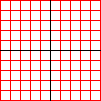
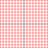
Some other examples where the images contain a (red) grid, which should align with the light grey grid of the container background.
Other, slightly more complex, examples: images in floated containers, an image gallery with captions.
An article on this problem by Steve Clay.
Many thanks to Ingo Chao, for his help and comments.